
Photo by Team TGM
Webflow is a visual website builder that allows you to design responsive websites without writing code. It provides powerful, modular building blocks you can drag and drop to create sections like contact forms, pop-ups, image galleries, sliders, pricing tables, and more.
If you’re new to Webflow, you might want to first check out our What Is Webflow? The Tool Designers Love to get a better understanding of the platform before diving into its modules.
In this article, you’ll learn about the key modules available in Webflow, how to use them, and which ones are essential for different types of websites. Each module includes a screenshot suggestion, so you can easily visualize how it appears in the Webflow Designer.
Table of Content:
What Are Webflow Modules?
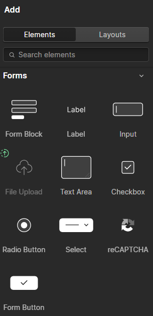
Modules in Webflow are pre-built or customizable components that allow you to add functionality and content to your website. These include everything from forms and tabs to image galleries and navigation menus. You’ll find all these modules in the Elements panel inside the Webflow Designer.
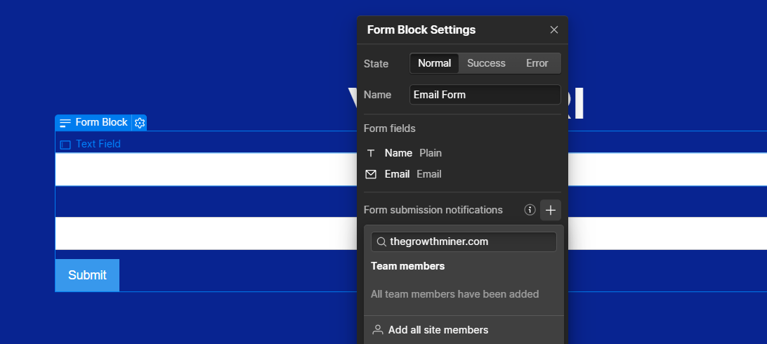
1. Contact Form
A contact form is essential for capturing user information, receiving inquiries, or collecting email subscribers.
How to Add:
- Open the Add Elements panel
- Scroll down to the Forms section
- Drag the Form Block onto your canvas
You can customize each field, add validation, and change button labels or messages. Once connected to a form handler or Webflow’s native form system, submissions can be managed directly from the Webflow dashboard.
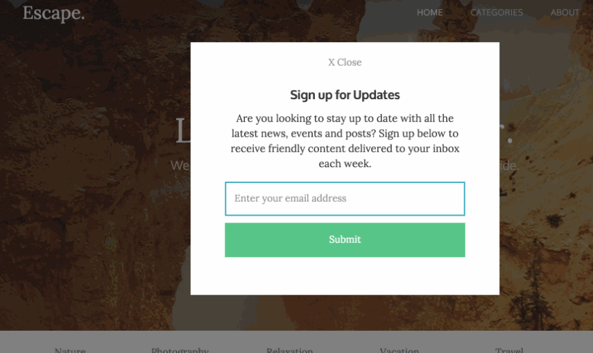
2. Pop-Up Modal
Pop-ups are useful for displaying announcements, offers, lead forms, or alerts without navigating to a new page.
How to Add:
- Add a Div Block and set it to a fixed position with top, bottom, left, and right set to zero
- Center the content using Flexbox
- Inside the div, add text, images, or a form
- Use interactions to make the pop-up appear and disappear based on triggers like a button click
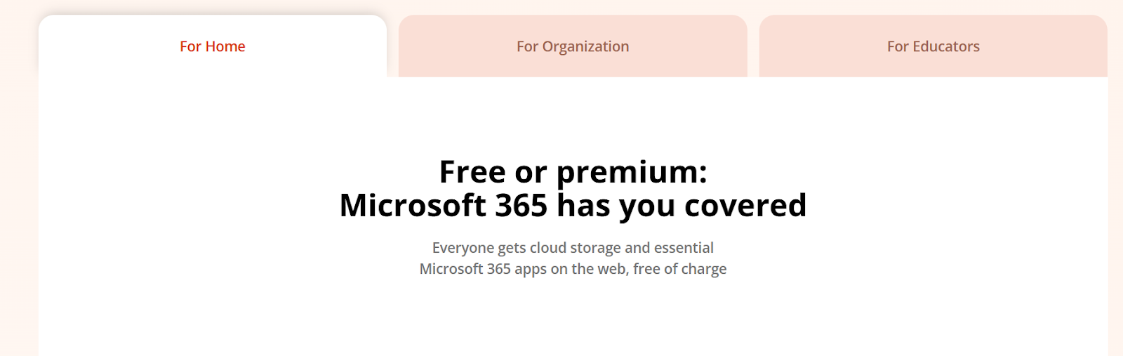
3. Tabs
Tabs allow you to display categorized or switchable content without needing multiple sections or pages.
How to Add:
- Drag in the Tabs component from the Add Elements panel
- Add content inside each tab pane
- Customize tab links and tab content areas
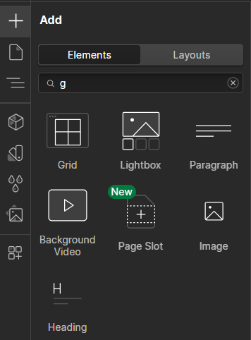
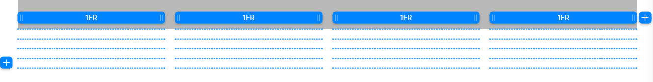
4. Grid or Table Layouts
Webflow does not have a default table element, but you can build responsive tables using the Grid layout system.
How to Add:
- Add a Grid element from the Layout section
- Choose the number of rows and columns
- Place text or images inside each cell
5. Slider
A slider is ideal for showcasing image galleries, testimonials, or featured content in a rotating format.
How to Add:
- Drag in the Slider component
- Add content to each slide, including text, images, or buttons
- Customize slide timing, arrows, and transition effects
-
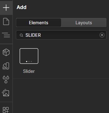
Webflow – Slider Element 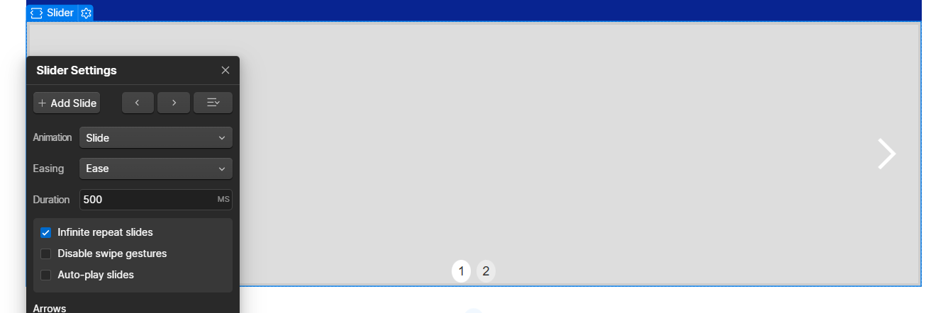
Webflow – Slider Settings
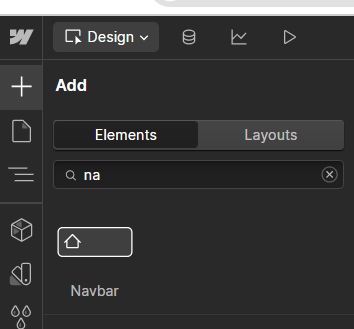
6. Navbar (Navigation Bar)
Navigation bars help users move around your site. Webflow offers a responsive Navbar module that works on desktop and mobile.
How to Add:
- Drag the Navbar element onto your page
- Replace the logo, edit links, and customize mobile menu behavior
- Use the Style panel to adjust font, colors, and spacing

7. Lightbox Gallery
A Lightbox lets users click on an image and view it in a larger, focused pop-up. It’s great for portfolios or product galleries.
How to Add:
- Add a Lightbox element from the Media section
- Upload your image and link it to the lightbox
- Group lightboxes together to enable a scrollable gallery view

Show a grid of clickable thumbnails with one lightbox open. 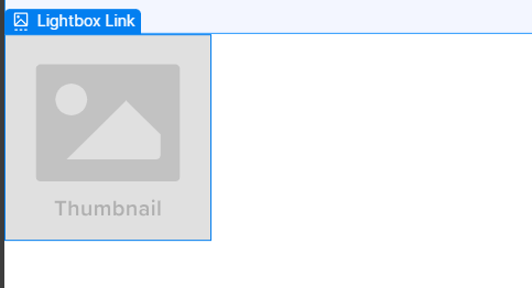
Webflow – Screenshot suggestion Show a grid of clickable thumbnails with one lightbox open
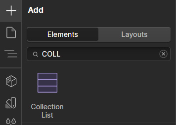
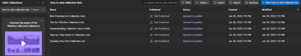
8. Collection Lists (CMS Module)
Collection Lists are dynamic content blocks powered by Webflow CMS. They’re used to display blog posts, portfolios, case studies, and more.
How to Add:
- Connect a CMS collection (like Blog Posts or Testimonials)
- Drag a Collection List onto your page
- Bind it to a content type, then style each item layout
9. Accordion (Expandable Content)
Although not a default component, accordions can be built using interactions to show and hide content when clicking on a question or heading.
How to Add:
- Use a Div Block for the accordion item
- Add a heading and hidden paragraph inside
- Apply interactions to expand/collapse the content when clicked
10. Symbols (Reusable Components)
Symbols allow you to reuse elements like headers, footers, or call-to-action sections across multiple pages.
How to Use:
- Select any element or group of elements
- Right-click and convert it into a Symbol
- Use this Symbol on other pages and update it globally
Other Useful Modules in Webflow
- Video embeds (YouTube, Vimeo, Lottie)
- Background videos
- Social icons
- Pagination and filtering (via CMS or custom code)
- Forms with file upload
- Responsive cards or feature boxes
- Countdown timers (via custom embed)
Conclusion
Webflow gives you all the essential modules you need to build a complete, modern, and responsive website — without touching a line of code. Whether you’re building a portfolio, business site, or landing page, modules like forms, tabs, sliders, lightboxes, and CMS collections help you do more in less time.
By mastering these core modules, even beginners can create highly functional websites with professional-level design and performance.
-
Yes, Webflow allows you to build tabs natively, and accordions can be created using interactions — no code required.


